
[논문 리뷰] Spatial-temporal Analysis of COVID-19's Impact on Human Mobility: the Case of the United States
이 연구는 미국 내 인간 이동성에 대한 코로나19의 시공간적 영향을 애플 이동성 데이터와 구글 트렌드를 활용해 분석한다. 공공의 인식(검색 트렌드로 측정)과 이동성 변화 사이에 14일의 지연이 있음을 규명하였고, 지리적 근접성에 따라 상태들이 군집화됨을 확인하였으며, 2020년 4월 중순 기준 네트워크 중심성 지표인 차수(−7.7%), 가까움(−6.9%), 그리고 중간성(−21.6%)의 상당한 감소를 보였다.
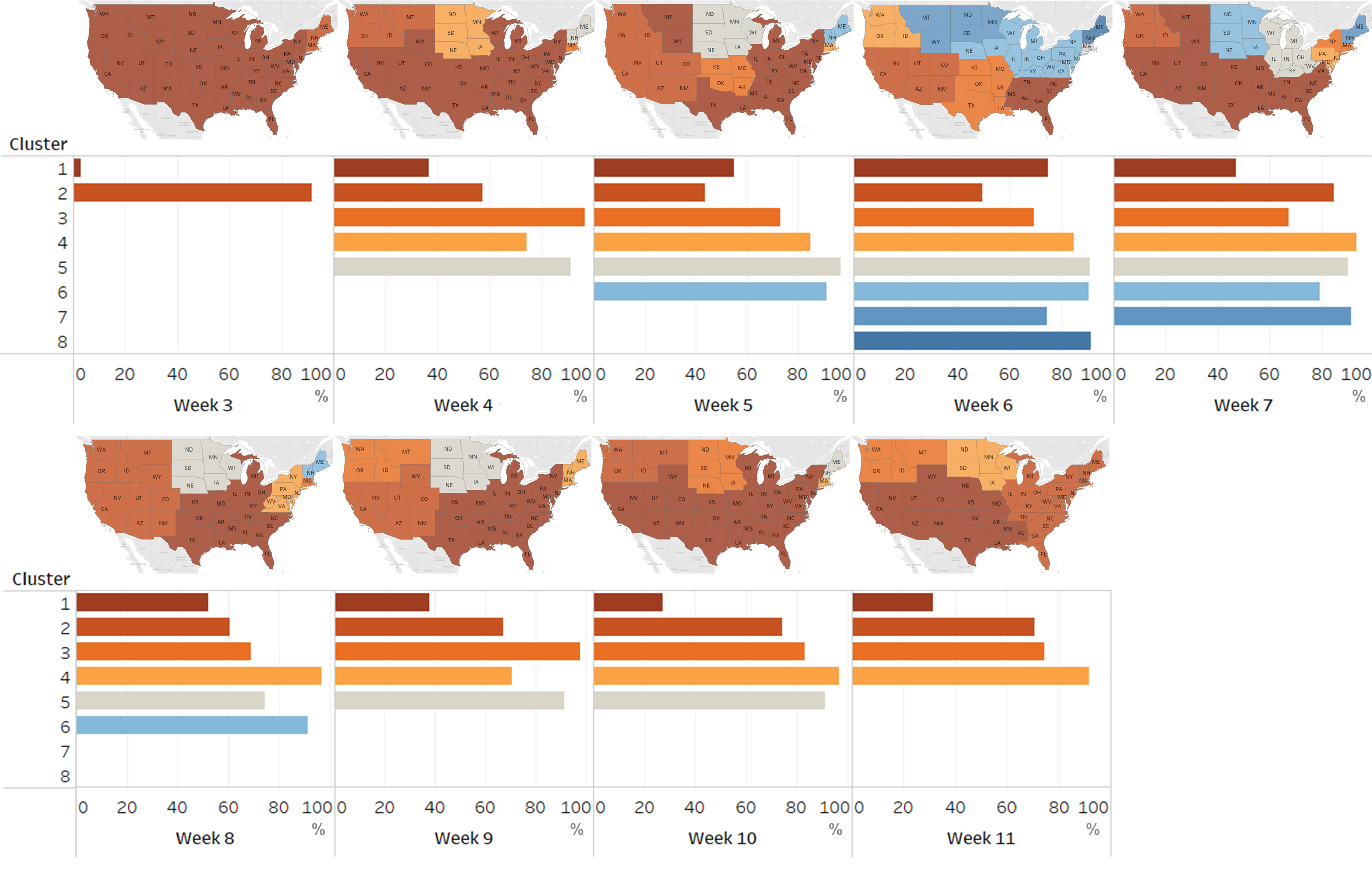
COVID-19 has been affecting every aspect of societal life including human mobility since December, 2019. In this paper, we study the impact of COVID-19 on human mobility patterns at the state level within the United States. From the temporal perspective, we find that the change of mobility patterns does not necessarily correlate with government policies and guidelines, but is more related to people's awareness of the pandemic, which is reflected by the search data from Google Trends. Our results show that it takes on average 14 days for the mobility patterns to adjust to the new situation. From the spatial perspective, we conduct a state-level network analysis and clustering using the mobility data from Multiscale Dynamic Human Mobility Flow Dataset. As a result, we find that 1) states in the same cluster have shorter geographical distances; 2) a 14-day delay again is found between the time when the largest number of clusters appears and the peak of Coronavirus-related search queries on Google Trends; and 3) a major reduction in other network flow properties, namely degree, closeness, and betweenness, of all states from the week of March 2 to the week of April 6 (the week of the largest number of clusters).
연구 동기 및 목표
- 미국 주들 간 코로나19에 대한 공공의 인식과 인간 이동 패턴 변화 사이의 시간 지연을 분석하기 위해.
- 네트워크 분석 및 군집 기법을 활용해 주 간 이동 패턴의 공간적 구조를 조사하기 위해.
- 팬데믹 초기 단계 동안 이동성 네트워크 특성—차수, 가까움, 중간성—의 변화를 정량화하기 위해.
- ‘코로나19’에 대한 구글 검색 트렌드와 주 수준에서의 이동성 행동 변화 간 관계를 탐색하기 위해.
- 특히 공공의 우려가 최고조에 이르렀을 때인 3월 초부터 4월 중순까지 주 수준의 이동 패턴 변화를 평가하기 위해.
제안 방법
- 2020년 1월 13일부터 7월 20일까지 미국 전역의 주들에 대해 매일의 상대적 이동 흐름(1월 13일을 기준으로 정규화)을 확보하기 위해 애플의 코로나19 이동성 추세 보고서를 활용하였다.
- 공공의 인식과 팬데믹에 대한 인식을 대체하기 위해 주 수준의 ‘코로나19’ 검색량 데이터를 구글 트렌드에서 통합하였다.
- 주들을 노드로, 주 간 이동 흐름을 간의 가중치로 사용하여 주 수준의 이동성 네트워크를 구축하였다.
- 지리적 거리를 공간적 제약 조건으로 삼아, 유사한 이동 패턴을 보이는 주들의 군집을 식별하기 위해 네트워크 군집 알고리즘을 적용하였다.
- 각 주의 네트워크 중심성 지표인 차수, 가까움, 중간성을 계산하여 이동성 영향력과 연결성의 변화를 평가하였다.
- 팬데믹 초기 단계의 핵심 시기인 3월 2일 주와 공적 고립이 최고조에 이르렀던 4월 6일 주 사이의 비교 분석을 수행하여 네트워크 특성 감소를 분석하였다.
![Figure 1 : The number of days of delay reflected by Apple mobility data [ 2 ] to Google search data [ 15 ] for all states. The average delay of people’s mobility adjustment to their awareness of the pandemic is 14 days.](https://ar5iv.labs.arxiv.org/html/2010.03707/assets/figures/delay.png)
실험 결과
연구 질문
- RQ1‘코로나19’에 대한 공공의 인식(구글 검색 트렌드로 나타남)과 인간 이동 패턴 변화 사이에 측정 가능한 시간 지연이 존재하는가?
- RQ2주 간 이동 패턴은 어떻게 공간적으로 군집화되며, 이 군집은 지리적 근접성과 일치하는가?
- RQ3‘코로나19’에 대한 구글 검색량의 최고조와 가장 많은 이동성 군집이 나타난 시점 사이의 시간적 관계는 어떠한가?
- RQ4초기 팬데믹 파동 기간 동안 주요 네트워크 특성인 차수, 가까움, 중간성은 미국 주들 전반에서 얼마나 감소했는가?
- RQ5이동성 네트워크 중심성 감소가 가장 심한 주들은 어디이며, 이들의 지리적 및 인구 통계적 특성에서 어떤 패턴이 드러나는가?
주요 결과
- 평균적으로, 미국 주들 전역에서 구글 트렌드로 측정된 공공의 인식 증가와 관찰 가능한 인간 이동 패턴 변화 사이에 14일의 지연이 존재한다.
- ‘코로나19’에 대한 구글 검색량의 최고조 이후 약 14일 후에 가장 많은 이동성 군집이 나타났으며, 이는 행동 적응에서 관찰된 시간 지연을 확인한다.
- 동일한 이동성 군집에 속한 주들은 서로 지리적으로 가까이 위치해 있으며, 이는 근접성이 이동성 네트워크 형성에 핵심적인 역할을 한다는 것을 시사한다.
- 3월 2일 주에서 4월 6일 주로의 기간 동안, 미국 전역의 주들이 네트워크 중심성 감소를 경험하였다: 평균 차수는 7.7% 감소했고, 가까움은 6.9%, 중간성은 21.6% 감소하였다.
- 네바다, Wisconsin, 뉴저지 주는 중간성 감소 비율이 각각 97.8%, 57.1%, 53.7%로 가장 높아 이들이 이동성 허브로서의 역할이 급격히 약화되었음을 나타낸다.
- 차수, 가까움, 중간성 감소 비율이 가장 큰 상위 10개 주들은 상당한 감소를 보였으며, 표준편차가 각각 9.7%, 4.0%, 27.3%로 나타나 주들 간 이동성 방해의 변동성이 높음을 시사한다.
더 나은 연구,지금 바로 시작하세요
논문 읽기부터 검토까지, 연구 시간을 획기적으로 줄여보세요.
카드 등록 없음 · 무료 플랜 제공
이 리뷰는 AI가 만들고, 인간 에디터가 검토했습니다.