
[Paper Review] Dead or Alive: Continuous Data Profiling for Interactive Data Science
This paper introduces AutoProfiler, a Jupyter notebook extension that enables continuous, live data profiling by automatically displaying interactive visual summaries and summary statistics for dataframes, updating in real time as data changes. In a user study, 91% of insights were discovered through the tool rather than manual coding, demonstrating that both live and on-demand profiling significantly improve insight detection and data quality awareness in interactive data science workflows.
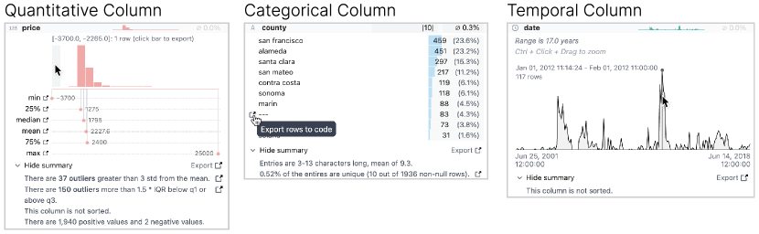
Profiling data by plotting distributions and analyzing summary statistics is a critical step throughout data analysis. Currently, this process is manual and tedious since analysts must write extra code to examine their data after every transformation. This inefficiency may lead to data scientists profiling their data infrequently, rather than after each transformation, making it easy for them to miss important errors or insights. We propose continuous data profiling as a process that allows analysts to immediately see interactive visual summaries of their data throughout their data analysis to facilitate fast and thorough analysis. Our system, AutoProfiler, presents three ways to support continuous data profiling: it automatically displays data distributions and summary statistics to facilitate data comprehension; it is live, so visualizations are always accessible and update automatically as the data updates; it supports follow up analysis and documentation by authoring code for the user in the notebook. In a user study with 16 participants, we evaluate two versions of our system that integrate different levels of automation: both automatically show data profiles and facilitate code authoring, however, one version updates reactively and the other updates only on demand. We find that both tools facilitate insight discovery with 91% of user-generated insights originating from the tools rather than manual profiling code written by users. Participants found live updates intuitive and felt it helped them verify their transformations while those with on-demand profiles liked the ability to look at past visualizations. We also present a longitudinal case study on how AutoProfiler helped domain scientists find serendipitous insights about their data through automatic, live data profiles. Our results have implications for the design of future tools that offer automated data analysis support.
Motivation & Objective
- To address the inefficiency and inconsistency of manual data profiling in interactive data science workflows.
- To reduce the cognitive and time burden of exploratory data analysis (EDA) by automating the generation of data profiles.
- To evaluate how live versus on-demand data profiling affects insight discovery and user workflow integration.
- To explore how automated tools can support serendipitous insight discovery and facilitate follow-up analysis through code export.
Proposed method
- AutoProfiler integrates into Jupyter notebooks to automatically display data distributions and summary statistics for each dataframe and column upon creation or update.
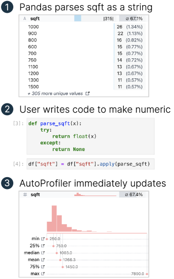
- The system provides live updates, ensuring visualizations reflect the current state of data in memory in real time.
- It supports on-demand profiling as a static, inline alternative to compare user experience and performance.
- The tool generates reusable code templates for visualizations and data operations, enabling users to export and modify analysis code directly from the interface.
- A longitudinal case study was conducted to observe how continuous profiling led to unexpected data quality insights in real-world data science tasks.
- A controlled user study with 16 participants compared live and on-demand versions of AutoProfiler to assess insight generation and usability.
Experimental results
Research questions
- RQ1How does continuous, live data profiling compare to on-demand profiling in supporting insight discovery during data analysis?
- RQ2To what extent do automated data profiles reduce reliance on manual profiling code?
- RQ3How do users perceive the usability and value of live versus static data profiles in interactive data science workflows?
- RQ4Can automated data profiling tools facilitate serendipitous discovery of data quality issues?
- RQ5How effective is code export functionality in supporting follow-up analysis and documentation?
Key findings
- 91% of user-generated insights during the study originated from the AutoProfiler tool rather than from manually written profiling code.
- Participants using the live version found updates intuitive and helpful for verifying data transformations in real time.
- Users of the on-demand (dead) version appreciated the ability to review past visualizations and compare data states.
- The longitudinal case study revealed that continuous profiling enabled domain scientists to discover unexpected data quality issues, such as flat distributions and anomalous values, through automatic, persistent visualization.
- The code export feature was highly valued, as it allowed users to quickly adapt and extend visualizations without writing code from scratch.
- Both live and on-demand versions of AutoProfiler significantly reduced the effort required for EDA while increasing the likelihood of detecting subtle data quality issues.
Better researchstarts right now
From reading papers to final review, dramatically reduce your research time.
No credit card · Free plan available
This review was created by AI and reviewed by human editors.