
[Paper Review] Mapping county-level mobility pattern changes in the United States in response to COVID-19
The paper presents an interactive web portal that tracks county-level mobility changes in the U.S. during COVID-19 using aggregated smartphone data to measure median travel distance and stay-at-home dwell time. It analyzes patterns before, during, and after stay-at-home orders.
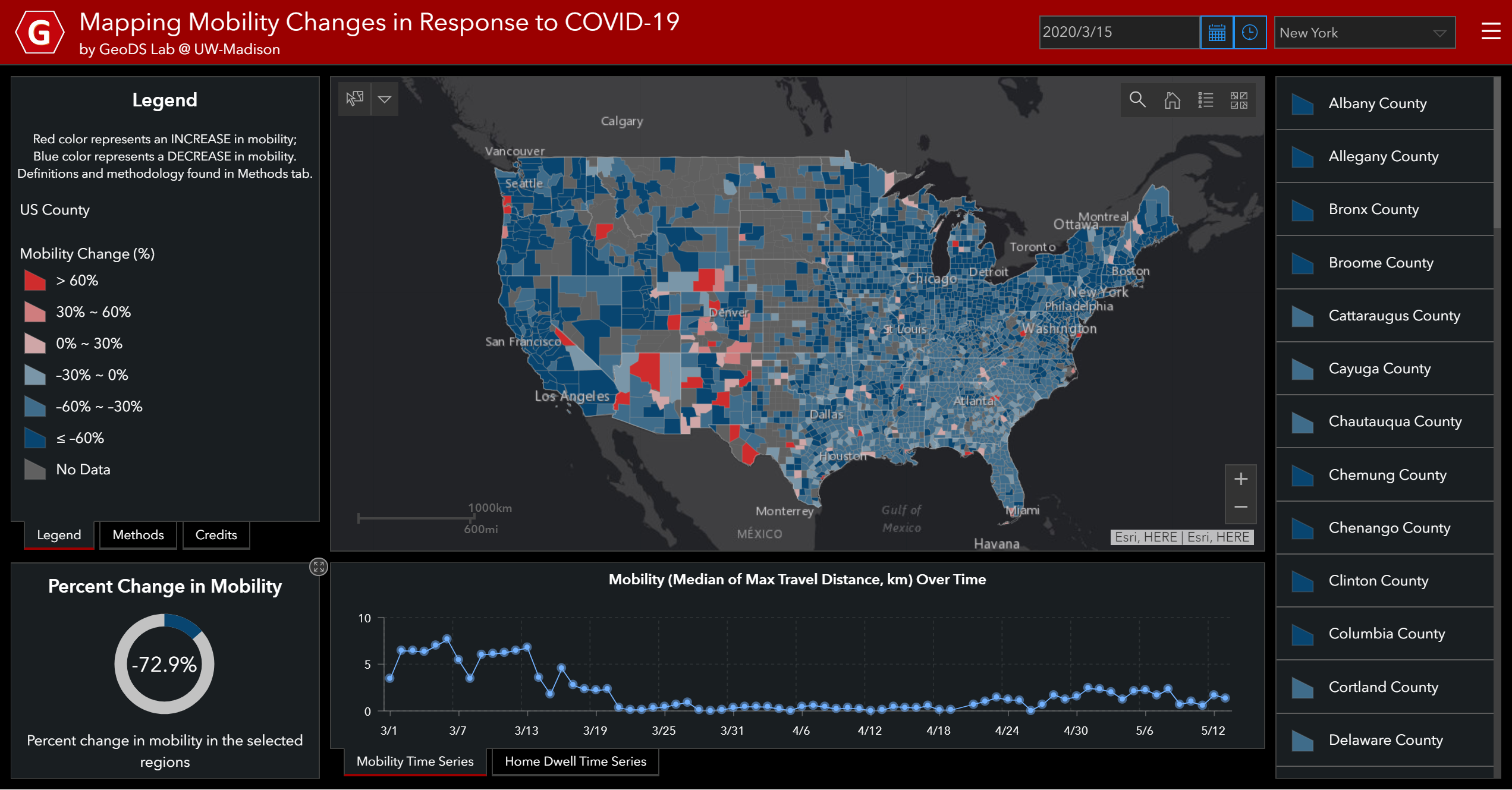
To contain the Coronavirus disease (COVID-19) pandemic, one of the non-pharmacological epidemic control measures in response to the COVID-19 outbreak is reducing the transmission rate of SARS-COV-2 in the population through (physical) social distancing. An interactive web-based mapping platform that provides timely quantitative information on how people in different counties and states reacted to the social distancing guidelines was developed with the support of the National Science Foundation (NSF). It integrates geographic information systems (GIS) and daily updated human mobility statistical patterns derived from large-scale anonymized and aggregated smartphone location big data at the county-level in the United States, and aims to increase risk awareness of the public, support governmental decision-making, and help enhance community responses to the COVID-19 outbreak.
Motivation & Objective
- Provide timely, county-level quantitative mobility indicators to reflect social distancing responses to COVID-19.
- Integrate GIS with daily-updated mobility data to support public health decision-making.
- Assess mobility changes across three periods: pre-orders, during stay-at-home mandates, and reopening.
Proposed method
- Use Descartes Labs mobility data to calculate daily max-distance mobility per county and derive a baseline from weekdays between 2/17/2020 and 3/7/2020.
- Compute Median Travel Distance as the median of daily maximum distances for all samples in a region.
- Compute Percent Change in Mobility relative to the baseline.
- Use SafeGraph Social Distancing Metrics to derive Median Stay-at-Home Dwell Time per county.
- Aggregate device-level data to county level via home location and Geohash-7 granularity, then produce web maps and time-series items in ArcGIS Online.
- Design the dashboard with three layers: Data/Feature, Methodology, and Application, and deploy with ArcGIS Dashboards and Experience Builder.
Experimental results
Research questions
- RQ1How did county-level mobility patterns change in response to statewide stay-at-home orders?
- RQ2What geographic heterogeneity exists in adherence to social distancing across the United States?
- RQ3How did mobility rebound during partial reopening periods and what factors correlate with these changes?
- RQ4What is the relationship between stay-at-home dwell time and regional infection dynamics across states?
Key findings
- Mobility changes were geographically heterogeneous, with widespread reductions (blue counties) after stay-at-home orders and some counties showing increased movement (red counties).
- Median travel distance dropped significantly in places like New York where stays at home were highly adherent (e.g., reductions to near 0.1 km in some counties) and varied across counties.
- Mobility began increasing again with early May reopenings, reflecting a rebound in travel distances.
- Three-day moving averages show higher stay-at-home dwell time in the top infected states compared to the least infected states.
- The platform enables mobility pattern recognition, monitoring, modeling, and decision support for public health interventions.
- The study notes that reduced mobility does not guarantee physical distancing as defined by CDC, highlighting data limitations and privacy considerations.
Better researchstarts right now
From reading papers to final review, dramatically reduce your research time.
No credit card · Free plan available
This review was created by AI and reviewed by human editors.